Brand · 2026-11-11
The pikisel brand
Our logo, colors and type, how to use them, and every file. Writing about pikisel, or putting it beside your own name? This page is for you.
Logo
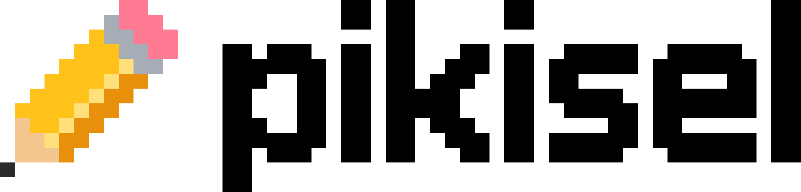
The pencil and the name together. Use it first, wherever pikisel needs to be recognised: black on light, white on dark. Klasik, the yellow pencil, is its color version.



Mark
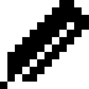
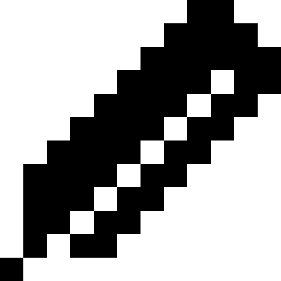
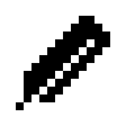
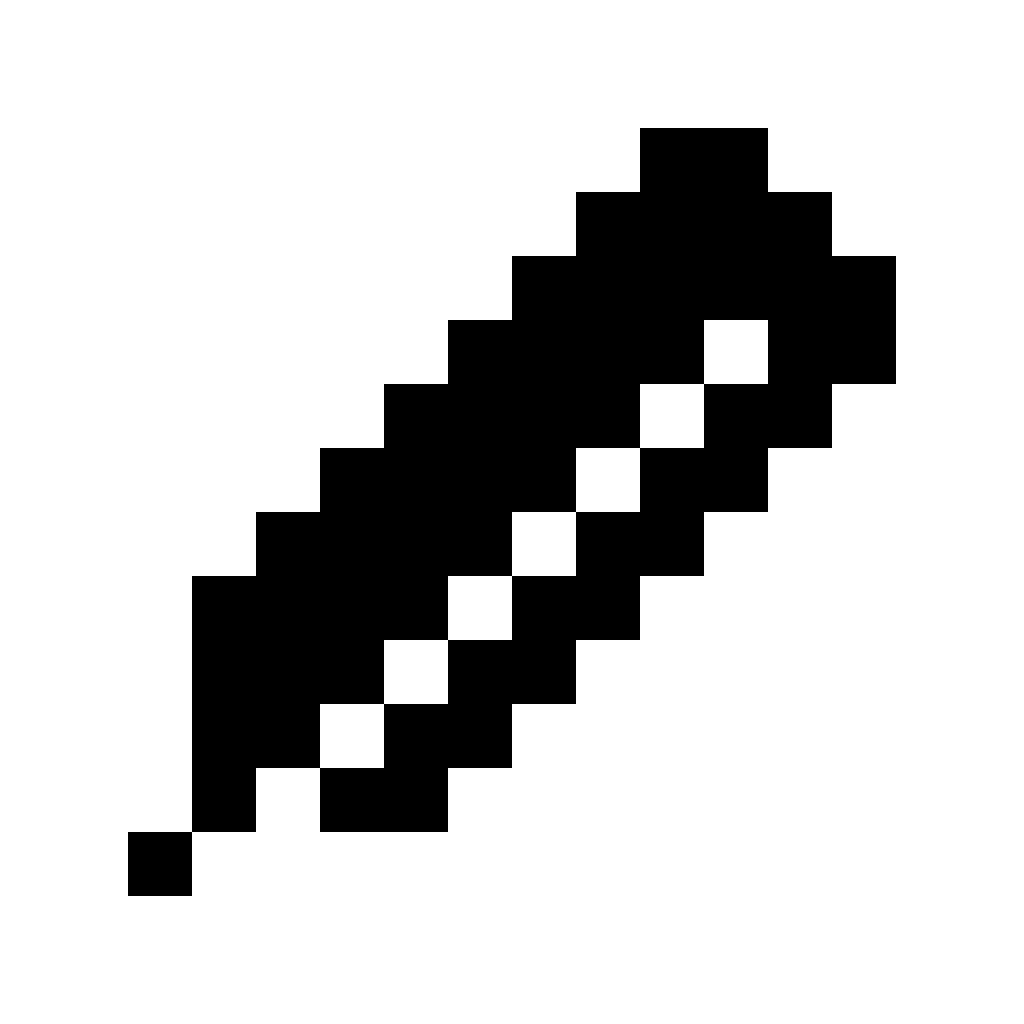
A pixel pencil, twelve pixels square: an eraser, a ferrule, a body with its highlight, the wood and the lead, a pixel at its point. It stands alone; in its square it is an app icon, a favicon and a profile picture.
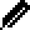

Twelve pixels square · a pixel of the pencil is a pixel of the name


In its square











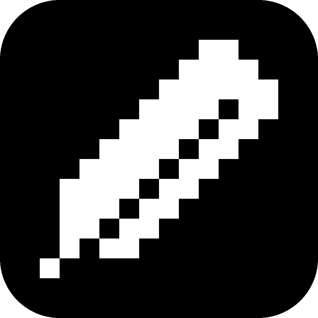


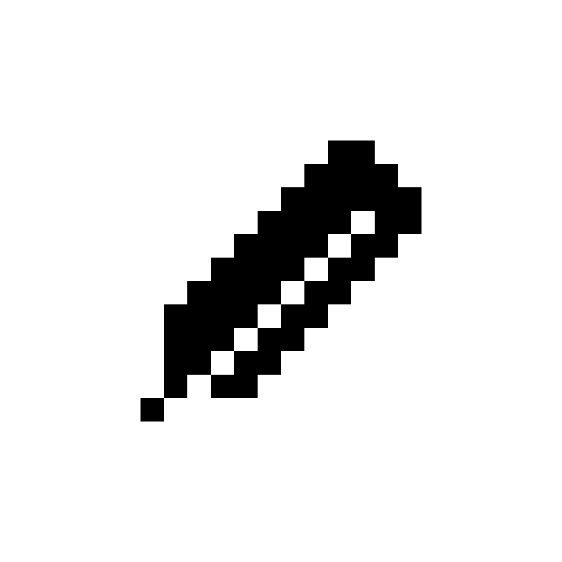
Profile picture, light
Square, 1152 px. The pencil sits at half the side, so a round crop never touches it.
PNG 1152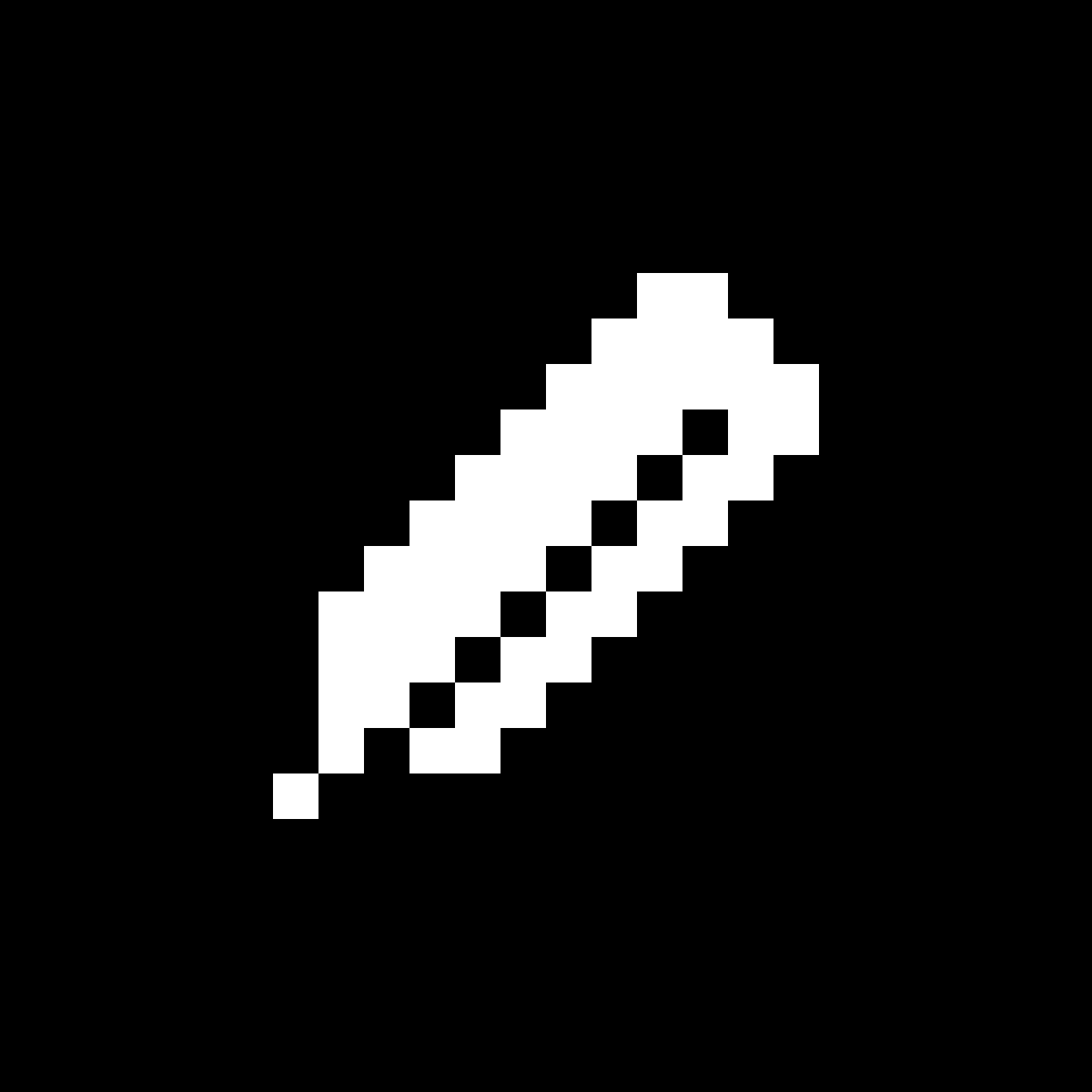
Profile picture, dark
Square, 1152 px. The pencil sits at half the side, so a round crop never touches it.
PNG 1152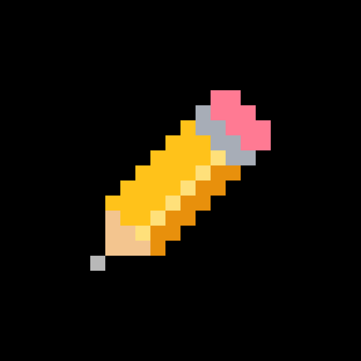
Profile picture, klasik
Square, 1152 px. The pencil sits at half the side, so a round crop never touches it.
PNG 1152Space and size
Give the logo room, and never set it smaller than it can be read.
Clear space
x is half the pencil’s height. Keep text, edges and other logos out of it, and give more room when you can.
Smallest size
Shown at real size: the logo 13 px high, the pencil 12 px, one screen pixel to each of theirs. Larger, by whole numbers. In print, 5 mm.
Don’ts
Use the files as they are. Every change below makes it not our logo any more.
✕ Rotate it
✕ Stretch or squash it
✕ Recolor it
✕ Outline it
✕ Add effects
✕ Retype the name
Color
Black and white do the work, and one blue says where to look. In the dark theme black and white swap, and the blue gets a little lighter.
Core
#000000 · RGB 0 0 0
Type and the logo
In the dark theme: the page
#ffffff · RGB 255 255 255
The page
In the dark theme: type and the logo
#1747f5 · RGB 23 71 245
The one accent, used sparingly
In the dark theme #3F68FF
Klasik · the pencil’s own colors, for the logo in color only
Pencil yellow
#ffc21a
The body
Shade
#e8900c
Its shaded side
Shine
#ffe07a
Its highlight
Eraser pink
#ff7a93
The eraser
Ferrule
#a7adb7
The ferrule
Wood
#f3c58f
The wood
Lead
#2b2b2b
The lead; #b8b8b8 on dark
Neutrals and tints · light theme, dark theme
Ink
#2b2b2b · #d6d6d6
Second-level type
Gray
#6e6e6e · #8f8f8f
Small print and hints
Line
#e4e4e4 · #222222
Rules and borders
Panel
#f1f1f1 · #181818
Panels and fields
Blue tint
#e6ecff · #10204f
Behind blue type
Signals · the same in both themes
Lime
#e2f94e · RGB 226 249 78
Done, ready, a good state, with black type on it
Lilac
#c9b8ff · RGB 201 184 255
A price, called out, with black type on it
Orange
#ff4d12 · RGB 255 77 18
Errors and warnings only, with white type on it
The aura
A light on black, kept for one moment: buying credits. Never use it anywhere else.
Type
Two families. Departure Mono, a pixel face, for headlines; Aileron for everything else, in two weights. The name in the logo is Galmuri11 Bold’s pixels, drawn once. Size makes the order, then weight, never gray.
AI that draws in real pixels.
Departure Mono, by Helena Zhang: headlines, Turkish and the rest of Europe’s Latin letters included. A pixel face, so it is set at 22, 33 or 44 px and up by eleven, never tracked or made bolder.
Departure Mono on GitHubWhat is read is Regular.
What is clicked, SemiBold.
Labels in capitals · 12 px
Aileron, by Sora Sagano: everything else, in two weights. Regular for what is read, SemiBold for what is clicked and for prices, nothing bolder; labels in capitals with a little tracking.
Aileron at dot colonDeparture Mono and Galmuri11: SIL Open Font License · Aileron: CC0, public domain · code and changing numbers in the system’s monospace
Pixels
Pixel art is the product, so its pixels stay square: scale by whole numbers, nearest neighbour, never blur, smooth or rotate.
2× · ✓
4× · ✓
8× · ✓
✕ Smoothed
Voice
We write the way the product looks: little, plain and exact.
pikisel, in lowercase
Always, even at the start of a sentence.
Short and plain
Short sentences, everyday words. Say what something does.
Little text
Let the work show; cut every word that does not help.
Only what is true
Never promise what pikisel does not do, and use real numbers.
Working together
Putting pikisel beside your own name: a collaboration, an event, a launch. The lockup is drawn to the logo’s own measures.
We lead
One mark of space each side of the ×; the partner on our name’s baseline, as tall as it.
You lead
Your launch, your logo first. Everything else stays the same.
01
Ask first
Write to support@pikisel.art with what it is and where it will appear, and publish once we have said yes in writing.
02
Whoever leads goes first
Our launch: pikisel on the left. Yours: your logo on the left.
03
The same height
Size your logo to look as tall as our name, judged by eye; never as tall as our mark.
04
A mark of space
One mark’s height of space on each side of the ×, and the clear space around the whole.
05
No implied deal
Nothing that suggests a partnership, sponsorship or endorsement we have not agreed in writing.
06
Credit in plain text
Writing that your work was “made with pikisel” needs no permission.
In use
Where people meet the brand: in the product, on a phone, in a post.
Downloads
Everything above, in one ZIP or one file at a time. SVG for the web and Figma, PDF for Illustrator, Affinity and print, PNG with a transparent background.
The pikisel name and marks belong to us (Terms). Using them as this page says does not make you our partner or mean we endorse you. Questions: support@pikisel.art.